
Operating System
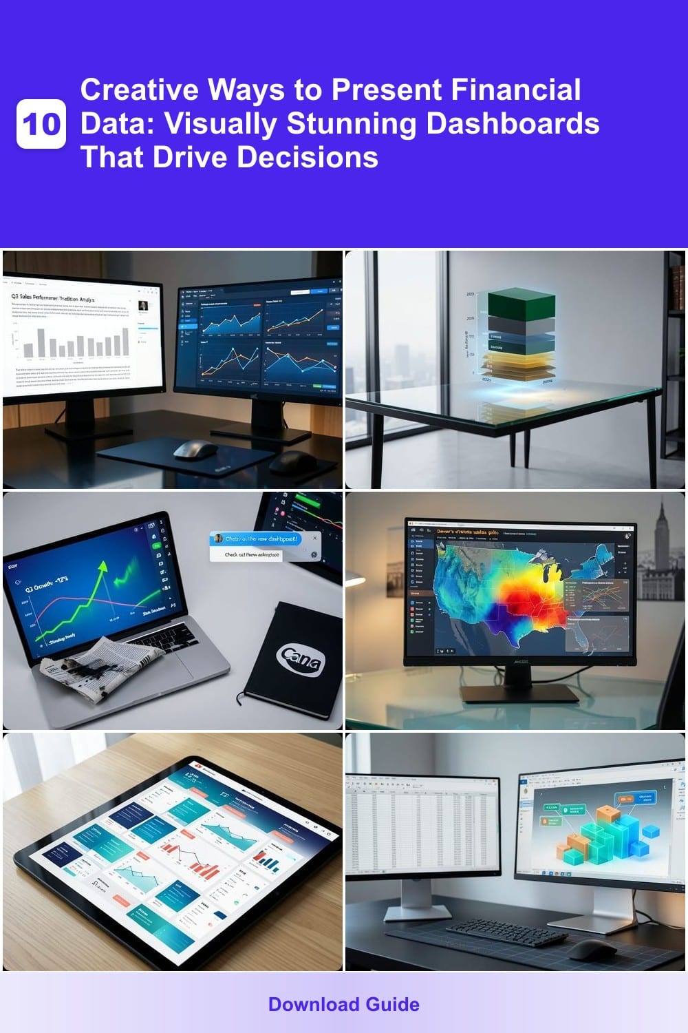
Boring spreadsheets won’t cut it in today’s data-driven world. These 10 creative financial data presentation methods transform raw numbers into compelling visuals that engage stakeholders and accelerate decision-making—perfect for analysts, executives, and business owners.
Interactive Storytelling with Tableau Public
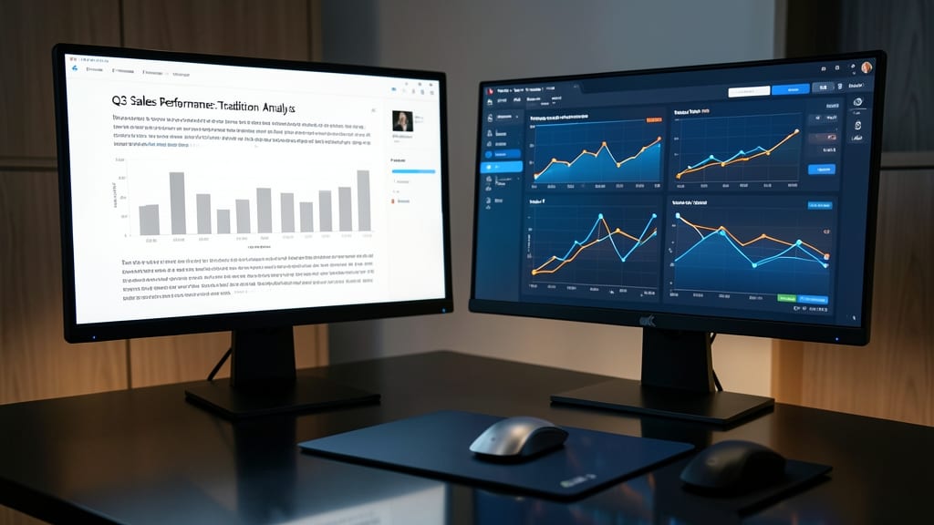
Tired of static slides that put investors to sleep? Tableau Public transforms dry financial data into dynamic, scrollable stories—no coding required. Its drag-and-drop interface lets you build dashboards with embedded filters, so stakeholders can explore trends like "what-if" scenarios in real time.
With zero-configuration publishing, your work lives on Tableau’s cloud platform, accessible via link. The tool’s animated trend lines and color-coded KPIs highlight patterns instantly, while real-time updates sync with live data sources. Even non-technical teams can create professional-grade visuals that feel like a custom app.
Perfect for founders pitching to VCs or analysts crafting investor decks—this tool bridges the gap between raw data and compelling narratives. ✨
3D Financial Model Visualizations in Power BI

When investors ask, "Show me the growth," flat charts just won’t cut it. Power BI’s 3D financial models turn multi-year projections into tangible, interactive experiences—like holding a financial crystal ball. The 3D Stacked Column Chart lets you layer revenue, expenses, and forecasts in a single view, while real-time tooltips reveal exact figures when stakeholders hover over segments.
You can animate transitions between years with Power BI’s built-in animations, making comparisons feel dynamic rather than static. The 3D Map Visual further enhances pitches by plotting geographic data (e.g., regional sales) in a spatial context. For startups, the free Power BI Desktop version offers enough power to create investor-ready visuals without premium costs.
This approach is perfect for founders who need to communicate complex scenarios (like "what-if" budget adjustments) in under 60 seconds. Just add a 3D model to your next pitch deck and watch stakeholders lean in. ✨
Animated GIFs for Financial Performance Snapshots

Tired of static PDFs or dense spreadsheets drowning in details? Animated GIFs transform financial snapshots into digestible, eye-catching updates—perfect for Slack standups or email summaries where brevity reigns.
Tools like Canva’s GIF maker or EZGIF’s animation suite let you loop key metrics (e.g., YoY revenue growth or profit margins) in under 30 seconds. Add color transitions to highlight improvements or warnings, and embed them directly in messages—no attachments needed. For deeper insights, pair them with static charts in a follow-up email.
This approach is ideal for finance teams juggling weekly reviews or startup founders who need to communicate progress without jargon. ⚡
Geospatial Heatmaps with ArcGIS Insights
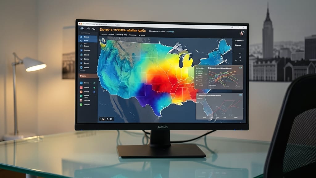
Tired of guessing where your business thrives (or struggles)? ArcGIS Insights turns raw location data into interactive heatmaps that reveal financial patterns at a glance—think sales spikes in Denver or underperforming real estate zones in Pittsburgh.
With drag-and-drop analytics, you can overlay sales figures, demographic data, or foot traffic onto maps, then spot trends with color-coded intensity gradients. The tool integrates with Excel, SQL, and APIs, so your existing data works seamlessly. No coding required—just upload, visualize, and act on insights like a retail executive or investor.
Perfect for real estate portfolios or multi-location businesses, this tool helps you make data-driven decisions faster than spreadsheets ever could. 🌟
Infographic-Style Reports in Canva Pro
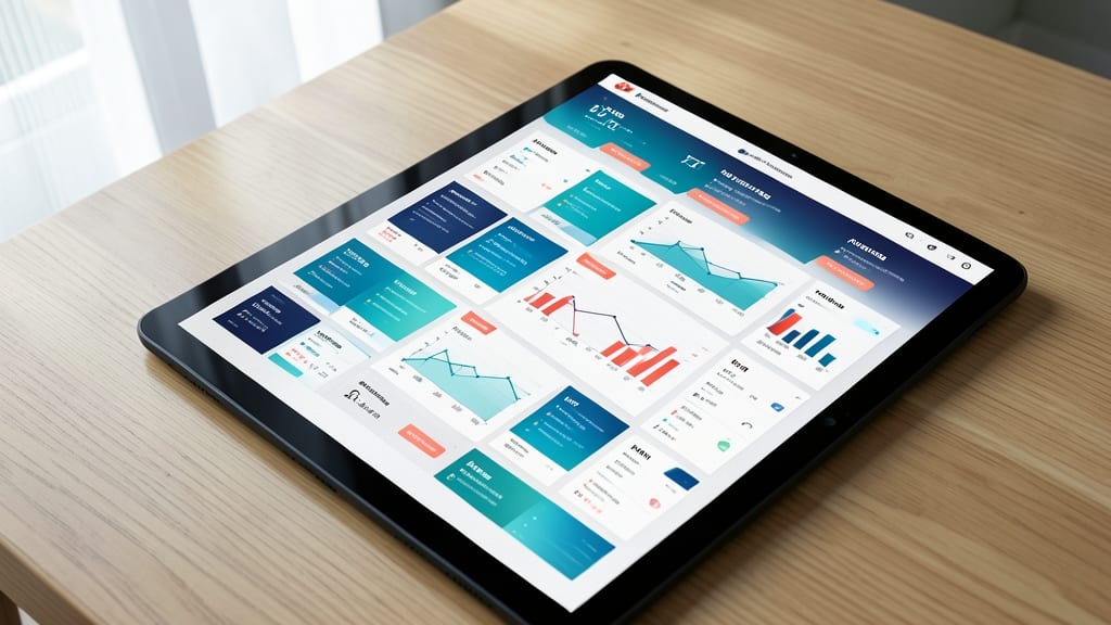
Tired of financial reports that look like they were designed in 1998? Canva Pro lets you transform dry data into sleek, print-ready infographics—no design degree required. Its 100+ financial-themed templates (think revenue breakdowns, expense trackers, and KPI dashboards) handle the heavy lifting, while drag-and-drop tools let you swap colors, fonts, and icons in seconds.
The real magic? Smart layers for alignment, auto-resizing for consistency, and brand kit integration to match your company’s colors and logos. Export as PDF, PNG, or even animated GIFs—ideal for quarterly meetings where stakeholders skim slides faster than they nod off. Pro tip: Use the "Magic Resize" feature to repurpose your infographic into a social media post or email header in one click.
This is the go-to for small teams or solo founders who need professional-grade visuals without hiring a designer. Perfect for those monthly board decks where clarity beats complexity every time. ✨
Dynamic Waterfall Charts in Excel 365
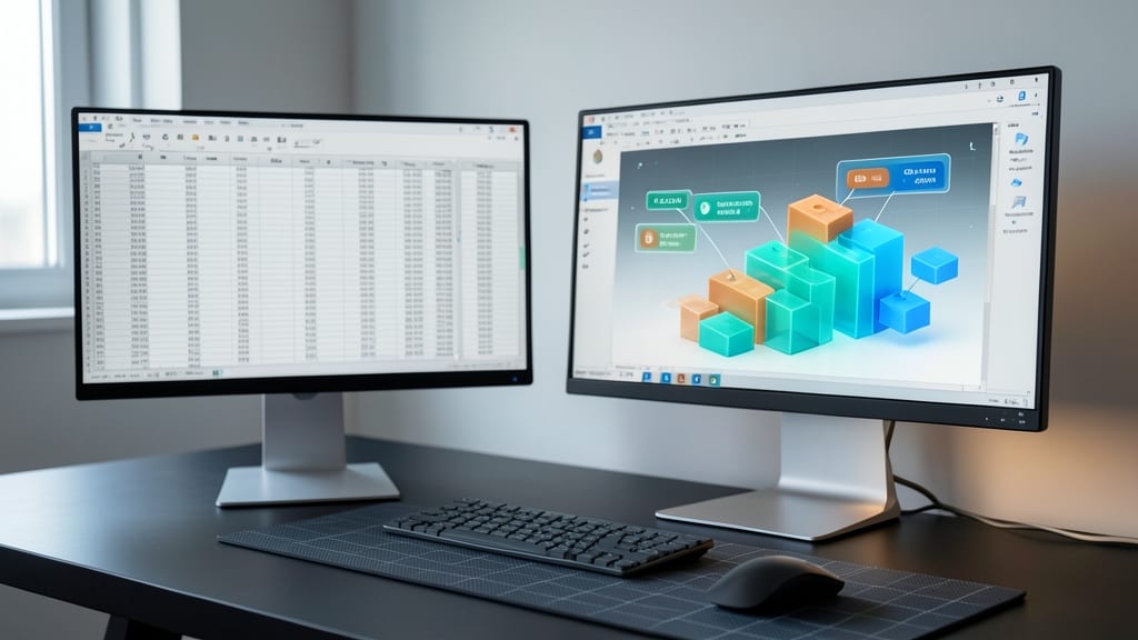
Tired of static spreadsheets that make profit breakdowns feel like homework? Excel 365’s dynamic waterfall charts turn financial analysis into an interactive experience—no coding required.
With real-time adjustments, you can drag-and-drop components like revenue, costs, and variances to instantly see their impact on net profit. The conditional formatting auto-applies color coding (green for gains, red for losses), while data labels appear on hover for clarity. Best of all, it syncs with your existing Excel data—no need to export or switch tools.
This is your go-to for finance teams who need collaborative, on-the-fly analysis without sacrificing precision. Perfect for quarterly reviews where every dollar matters. ⚡
Augmented Reality Financial Walkthroughs

For field teams drowning in spreadsheets but standing in front of physical assets, Zappar’s AR platform turns retail stores, warehouses, or branch locations into interactive data hubs. Imagine walking through a store while your phone overlays real-time sales metrics, customer foot traffic heatmaps, and inventory levels—all tied to specific zones.
The magic happens with zero-code setup: upload your financial data (CSV or API), pair it with a store floor plan, and Zappar handles the AR rendering. You’ll get 3D annotations (like floating arrows pointing to high-margin product placements) and voice-guided insights for hands-free learning. The Zappar Studio even lets you create custom triggers—scan a shelf, and up pops last week’s sales performance.
This is a game-changer for regional managers, franchise owners, or logistics teams who need to correlate physical spaces with financial KPIs. No more flipping between tablets and spreadsheets—just point, see, and act. ✨
Minimalist Line Art Dashboards in Figma

Tired of dashboards that overwhelm instead of inform? Figma’s minimalist line art dashboards strip away clutter while keeping your brand’s identity sharp—perfect for startups drowning in data but drowning less in design decisions.
With pre-built line art icon sets (or custom SVG uploads), you can highlight KPIs with a single accent color while maintaining a clean, distraction-free layout. The Figma Community offers free templates for financial dashboards, and the auto-layout feature ensures your design stays crisp even when data updates. Collaboration is seamless, too—team members can tweak metrics without breaking the visual flow.
This approach shines for early-stage startups pitching to investors or small teams needing to present financials without hiring a designer. Less is more when your goal is clarity over complexity. ✨
Voice-Activated Financial Summaries with Alexa

Tired of staring at screens during your morning commute? Alexa’s voice-activated financial summaries let you stay informed hands-free—whether you're driving, walking, or juggling meetings. With the right setup, you can get real-time revenue updates, expense alerts, and even custom financial news briefings delivered in a natural, conversational tone.
Using Amazon Alexa Skills like "Financial Times" or custom integrations with tools like QuickBooks or Xero, you can sync live data feeds to your smart speaker. The system converts complex metrics into digestible summaries—think, "Revenue grew 8% this quarter, with Q3 projections at $2.1M." For executives who rely on auditory learning, this method cuts through visual clutter while keeping you updated on critical KPIs without lifting a finger.
Best for CEOs, entrepreneurs, and finance leaders who prioritize multitasking and prefer verbal over visual data consumption. Perfect for those who’d rather hear their numbers while on a call or during a quick walk—no screen required. ✨
Comparative Benchmarking with D3.js
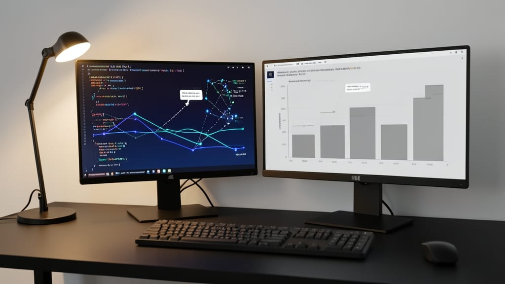
When comparing competitors’ financials, off-the-shelf charts just won’t cut it—you need D3.js for precision. This JavaScript library lets you build custom-coded visualizations tailored to your exact needs, from animated line graphs to interactive scatter plots with tooltips.
The real power lies in its scalability—whether you’re comparing quarterly earnings or decade-long trends, D3.js adapts to your dataset size. Add smooth transitions, zoomable axes, or color-coded benchmarks with minimal code. For data scientists, the ability to tweak every pixel ensures your visualizations align perfectly with your analysis.
Perfect for analysts who need pixel-perfect, reproducible comparisons—no templates, just pure control. 💡